

Spring Dining Room with Arhaus
I absolutely love to dine outdoors. There is something about it that makes every meal feel special, even if we are just throwing hot dogs & burgers on the grill. However, the heat of GA summers allows us only a few weeks each spring & fall to enjoy our meals al fresco. I felt inspired to design an indoor space that would make us feel like we were eating outside, minus the bug bites and humidity. :)
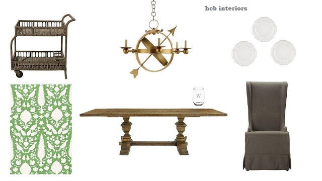
I decided the best way to freshen up for the season was to bring spring inside. The vibrant color & print of Schumacher's Chenonceau wallcovering in Aloe was the perfect starting point.
I added Arhaus' Wilhelm table in a natural wood tone, along with the gorgeous Alice dining chairs for contrast & comfort. Circa's Armillary Sphere Chandelier is yet another nod to the outdoors. And what's a great dinner party, indoors or out, without a bar cart for serving custom cocktails (or a cold glass of Chardonnay, as is my preference)? The faux rattan of the Revah outdoor cart adds a fun & casual vibe to the room.
Finally, I would be remiss to design a Southern dining room without monograms & plates on the walls. These acrylic wine glasses are perfect for parties, and I love the scalloped edge of the Avignon dinner plates. You can visit Arhaus here, or click here for more dining room inspiration.
Thanks, Arhaus, for giving me the chance to dream up a fun space for spring. Cheers!
Honoring Bobbi - Philanthropy & Design
We are nearing the anniversary of my mom's passing, and while she is never far from my thoughts, these days she is always on my mind. She was the kindest, most thoughtful person I have ever known, and I've been thinking a lot about her life goals. She accomplished almost everything on her list, but one thing she always wanted was to be a philanthropist. I've been trying to figure out how I could continue on with her dream, and I realized that no act is too small when it comes to promoting kindness.
So, I am offering you a deal: if you write to me by Monday, Dec. 5* and tell me about a philanthropic act that you have performed for others in the past week (or email me by Mon. about something you did over the weekend), I will send you a design idea board, at no charge. These boards are already designed, so they are not custom, but there will be a few different ones to choose from (i.e. farmhouse, neutral, mod traditional, etc.)
All you have to do is perform a philanthropic act and let me know about it, and you will be sent the design board of your choice. Pretty easy, right? Now go spread a little hope and love in this world - just like my mom did every day of her life. :)
*email me at hcbinteriors@gmail.com
Giving Back - National Philanthropy Day
I am so very grateful for the opportunity to follow my dreams and help others create a home. I am also very passionate about giving back. From now until the end of the year, I will donate 10% of all proceeds to one of three charities: Children's Healthcare of Atlanta, CURE Childhood Cancer, or Folds of Honor.
And, I will continue to donate in 2017, if you contact me before Dec. 31, 2016. It's a win-win: you get a new space, and someone in need benefits. If you're interested, or would like to see more examples of my work, please contact me at hcbinteriors@gmail.com
Thank you for helping others!

And, I will continue to donate in 2017, if you contact me before Dec. 31, 2016. It's a win-win: you get a new space, and someone in need benefits. If you're interested, or would like to see more examples of my work, please contact me at hcbinteriors@gmail.com
Thank you for helping others!
One Room Challenge Fall 2016 - Guest Bedroom Design Plan, Week 2
Welcome back to week 2 of the One Room Challenge! A quick synopsis - we are participating in the Calling It Home blog challenge, and updating our guest bedroom in just under 6 weeks. This week, I am presenting my design plan for our windowless basement guest room.
To be upfront with y'all, the only way my husband (aka my electrician, carpenter, and sometimes plumber) and I could fathom being a part of this round's ORC was if we agreed to tackle the room that would take the least amount of effort, time, and money. So, the majority of the room's elements are things we already have, and we are repurposing them (aka stealing) from other rooms in our home. Sometimeshoarding collecting pillows, lamps, etc. can come in handy.
We've also made zero progress on the room this week; we escaped to the mountains for a few days during my daughter's fall break, and it was totally worth it. I'll just have to put that much more effort into this upcoming week!
As for the design of the room, I mentioned in week 1 that I was going for a Southern coastal look. We love going to the beach, and I wanted to bring the relaxation we feel during our trips to our guests. It also helps that my in-laws gifted us a painting of the coast that has been in the family for years, and I can use it to tie many of the elements together. When we researched the name on the back, we discovered that the little-known artist has actually become quite the collector's item. And while it's not worth millions (or even close), it's neat to know that it does have a history.
The design brings together some of my favorites: buffalo check, toile (either classic or chinoiserie - haven't decided yet), and the color combo of creams and blues. To address the lack of lighting, both natural and overhead, I'm bringing in a lot of lamps. In addition, the room will have mirrors on two walls to bounce the lamplight.
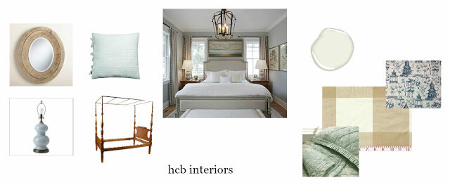
The inspiration image is a room I have loved for a long time. It was designed by Lisa Whitley for a Southern Living home in South Carolina. I especially love the painting over the bed, and the windows and drapery behind the bed. That got my wheels turning, and I realized I could give the impression of windows by hanging drapes behind our farmhouse 4 poster bed. I happen to have some P. Kaufman buffalo check drapes that did not work well in our home but I just couldn't let go of them, so they are getting a second life in this room. The other fabric in the room will most likely be either Pottery Barn's Matine toile in porcelain blue, or Lacefield Design's Pagodas Seaside. The walls are Benjamin Moore's White Dove (my go-to white).
Check back next week to see our progress (or lack thereof), and be sure to visit the other participants in the One Room Challenge!
To be upfront with y'all, the only way my husband (aka my electrician, carpenter, and sometimes plumber) and I could fathom being a part of this round's ORC was if we agreed to tackle the room that would take the least amount of effort, time, and money. So, the majority of the room's elements are things we already have, and we are repurposing them (aka stealing) from other rooms in our home. Sometimes
We've also made zero progress on the room this week; we escaped to the mountains for a few days during my daughter's fall break, and it was totally worth it. I'll just have to put that much more effort into this upcoming week!
As for the design of the room, I mentioned in week 1 that I was going for a Southern coastal look. We love going to the beach, and I wanted to bring the relaxation we feel during our trips to our guests. It also helps that my in-laws gifted us a painting of the coast that has been in the family for years, and I can use it to tie many of the elements together. When we researched the name on the back, we discovered that the little-known artist has actually become quite the collector's item. And while it's not worth millions (or even close), it's neat to know that it does have a history.
The design brings together some of my favorites: buffalo check, toile (either classic or chinoiserie - haven't decided yet), and the color combo of creams and blues. To address the lack of lighting, both natural and overhead, I'm bringing in a lot of lamps. In addition, the room will have mirrors on two walls to bounce the lamplight.
The inspiration image is a room I have loved for a long time. It was designed by Lisa Whitley for a Southern Living home in South Carolina. I especially love the painting over the bed, and the windows and drapery behind the bed. That got my wheels turning, and I realized I could give the impression of windows by hanging drapes behind our farmhouse 4 poster bed. I happen to have some P. Kaufman buffalo check drapes that did not work well in our home but I just couldn't let go of them, so they are getting a second life in this room. The other fabric in the room will most likely be either Pottery Barn's Matine toile in porcelain blue, or Lacefield Design's Pagodas Seaside. The walls are Benjamin Moore's White Dove (my go-to white).
Check back next week to see our progress (or lack thereof), and be sure to visit the other participants in the One Room Challenge!
One Room Challenge Spring 2016: The Plan...Or What's Left of It
Earlier this week, I had an entirely different post ready to go. And then Murphy decided to pay our ORC a little visit. Isn't it a little early in the game for such antics? You might be thinking, well at least at this point you have time to scramble for a solution. But some of the issues will not be solved until well after the finale, if they are solved at all. And one of them is my fault. Our big vacation of the year, the already paid for, non-refundable, dates-absolutely-cannot-be changed-vacation, occurs during the ORC. So, instead of 5 weeks to complete our room (the ORC is 6 Thursday postings, but actually only 5 full weeks), we only have 4. That was a fun conversation to have with my husband. Oops.
If you follow me on Instagram, you saw that my husband decided to tackle built-ins (which made the timeline convo afterwards even more awkward). I'm so grateful that he loves to take on projects like this. He's never done a project this big before, but that was true of the built-in office and the "mudcloset" in the last ORC, so I am confident he will knock it out of the park. This time he even has an assistant; my 5 year old, who loves to help us with home projects, and wants to open a renovation company a la Fixer Upper. So my husband sweetly included her in the demo stage, and she was so excited. We kept the first piece of molding she removed, just in case she decided she wanted it as a souvenir for her future self. Let's just pretend they (mostly her daddy) didn't put a big hole in the sheetrock.
On to the design...
White walls, gray trim, and traditional lighting accented with an incredible piece of abstract art like this beauty by MECArt on Etsy (except my version will be a lot more personal, and a little more budget friendly). If you notice, there is something important missing: beautiful fabrics, my favorite part. :(
My window hardware and drapes were part of the Murphy mess, and probably the largest part of my budget, so I don't want to be hasty in choosing a replacement. We may have bare windows for a while, although my husband has offered his college solution of flags and towels, so at least we have a backup plan.
Check back in next week to see what progress we've made, and make sure to visit the other participants to see how they're faring! It's an exciting (?) ride to be sure!
Also sharing with Thoughts of Home, so please stop by and visit those sharing there as well!
Modernizing Traditional Family Pieces
It is common in the South for families to pass pieces down for generations. I am blessed to have something in almost every room of my home that belonged to a family member at some point in time. However, the challenge comes when mixing those pieces with today's more modern, laidback lifestyle. Even the current traditional style is much more casual than our grandparents traditional tastes. It can be especially challenging when the piece you've inherited is completely opposite your own design choices, or is a treasured family heirloom that cannot be altered in any way (ie. paint) ;)
However, in my opinion, the best rooms are a balance of new and old. Older pieces have a patina and character that cannot be replicated, and often have a quality not found in today's furnishings. They add a sense of warmth to a room. The new keeps those older pieces from looking shabby, outdated, or dowdy. The design board below shows an example of this mix:

However, in my opinion, the best rooms are a balance of new and old. Older pieces have a patina and character that cannot be replicated, and often have a quality not found in today's furnishings. They add a sense of warmth to a room. The new keeps those older pieces from looking shabby, outdated, or dowdy. The design board below shows an example of this mix:
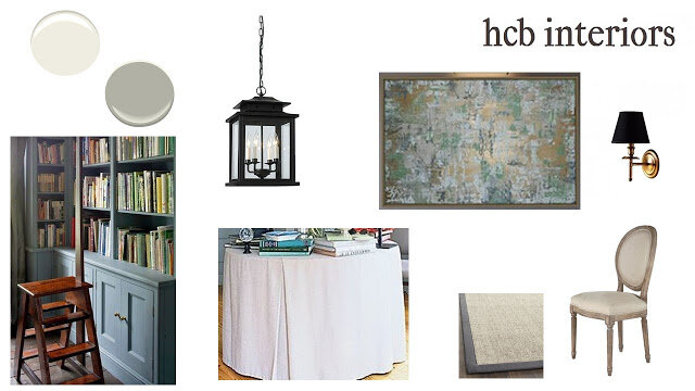
Two commonly inherited items are rugs and buffets. To balance out the traditional heaviness of these two pieces, I added in fun lighting (love that Sputnik style chandelier!), abstract art, and upholstered seating. I pulled the blues and golds from the rug, and used them in the art and lighting so that even though the pieces are very different stylistically, they still share a commonality.
To further ensure the space would read as modernized traditional, I used Farrow + Ball's Wevet (white) on the walls, and Worsted (gray) on the trim. By using color on the trim, instead of traditional white, the design continues to contrast the seriousness the older pieces bring to the space.
Hope this helps some of you who may be struggling with mixing those family pieces in with your own style. On a sidenote, Farrow + Ball released nine new colours this year, and they, along with Paige Minear at The Pink Clutch, are generously giving away a gallon to the reader who creates their favorite mood board. Head over to Paige's blog to find out how to enter. Good luck!